The Science of a Great Landing Page
January 30, 2023
7 minute ReadBy Emily Madison
One of the fundamental challenges today is finding ways to convert your potential customers into actual high lifetime value customers. The real challenge is navigating an ever-evolving digital landscape where we want to drive high quantity top-of-funnel activity while also ensuring excellent bottom-of-funnel conversion.
There are lots of ways you can attribute top-of-funnel activity, but for this article we want to focus on people who are coming to a web or mobile page for your business who you would ultimately like to turn into recurring customers.
These pages you’re creating are landing pages.
And the better you get with your conversion strategy, the better your marketing strategy will be.
Great Landing Pages: Stick to the Basics
There is no need to reinvent the wheel when it comes to landing pages. There are a few simple ways to set up your website and landing pages for success. Your potential customers have likely been using the internet for many years and are accustomed to a particular flow for website navigation. You will be doing yourself a favor by using a familiar layout.
The good news is that the most common landing page is actually a very simple layout. You can guide your potential customers to your end goal by laying out the page with a few standard items at the top arranging it in a Z-pattern with your most desired action in the top right of the page, and being sure to include a compelling call-to-action (CTA).
The Recipe
Logos go in the upper left corner; that is naturally where eyes will land on the page, starting their journey with your brand. In the opposite upper corner, put the most important action you need them to take. It’s likely a join or subscribe link.
To get your potential customers to convert, you want to ensure your landing page is set up for scanning. Even with the best and most compelling content, your website visitors are more likely to scan the page than read it word-for-word. They will only stop scanning when something catches their eye, but you can use this to your advantage by subconsciously guiding them where you want them to go. Because your users have come to expect landing pages to be set up a certain way, they will naturally start scanning the page in a Z-pattern.
As the name indicates, the Z-pattern moves from the upper left corner to the right corner before looking at your page header and ending on your CTA button. Use these areas to highlight important items, like the previously mentioned logo and login button or important headlines and images. For longer landing pages, you can repeat the zigzag motion down the page by alternating text, images and videos, so your visitors continue to scan toward the CTA.
One of the best ways to convert visitors into customers is to make it easy for them to complete the intended action — an attractive and eye-catching CTA will help. Making your CTA a different color than the page and a different shape will draw attention to it. Make your CTA a color that matches (or complements) your brand colors and experiment with CTA shapes other than a rectangle.
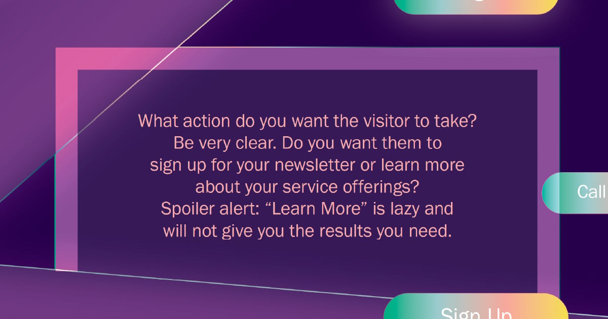
Don’t forget the importance of the text on your CTA – what action do you want the visitor to take? Be very clear. Do you want them to sign up for your newsletter or learn more about your service offerings? Spoiler alert: “Learn More” is lazy and will not give you the results you need. The text on the CTA should describe the action while also compelling the visitor to take the next step. If you find your visitors aren’t clicking on the button, try switching up the text to see if that helps.
Next-Level Landing Pages: Make a Splash With Three Types of Content
With the basics of a good landing page under your belt, there are a few ways you can take your landing pages to the next level. Keeping your landing pages simplistic with the end goal in mind, whatever that may be for your particular business, is important.
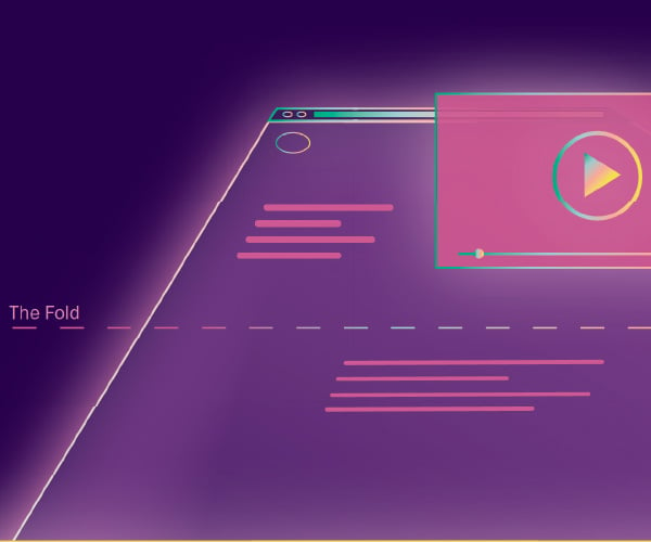
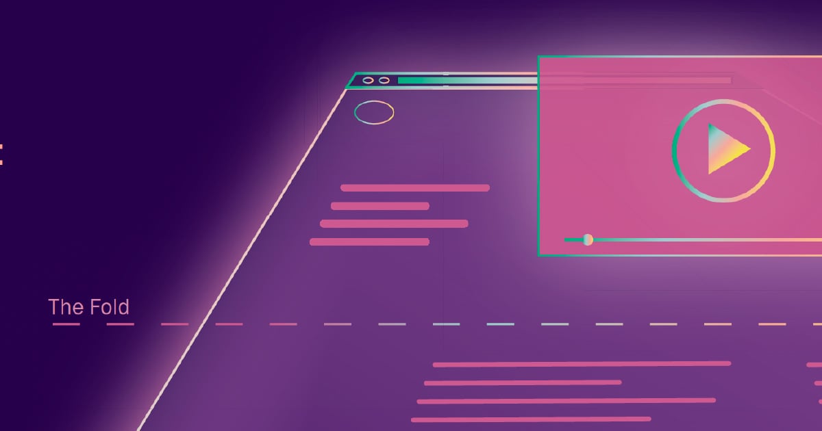
You will lose customers by overcomplicating the page, so it is best to stick to one or two types of content per page and ensure the value proposition and CTA are visible without having to scroll down, also known as “above the fold.” Your visitors want to know what is in it for them right away, so be sure to highlight what they will be getting out of supplying their information. By using videos, testimonials and forms, you can stand out from your competitors and reach potential customers in a variety of ways.
- One of the best ways you can use your landing pages for conversion is to include a video toward the top of the page. Studies have shown that a video explaining your value proposition is one of the most effective ways to get your visitors to take action to convert into customers.
Your video could be a tour of your car wash, a member of your team explaining the different packages you offer, a cartoon about the benefits of keeping your car clean or whatever fits your current goals. Try to keep the video to about 30 seconds to a minute to maximize its effectiveness.
However, not everyone will watch the video, so it would be in your best interest to include a bulleted list of benefits, programs, services offerings or whatever you are trying to promote in the video underneath it – that will cover all your bases between those who prefer video and those who prefer to read. This goes back to the previously mentioned concept of scanning; short and sweet bullet points will not bog down your visitors by allowing them to continue scanning the page and moving toward the CTA.
- Another great way to improve your conversion rate is through testimonials. Word-of-mouth is an invaluable marketing tool that helps to build credibility and validates your value quickly! With quotes from happy customers, you can reinforce the benefits and main selling points of your specific car wash business.
There are a few ways to include testimonials that can be effective: a testimonial section with quotes from real customers next to their name and photo, a video with customer testimonials filmed at your car wash, awards and certifications your car wash has received and links to social media posts from happy customers.
No matter how you choose to include testimonials, the most important thing is to ensure they are real and that you have the customers' approval to share them on your website. Because testimonials are such a powerful tool when it comes to conversion, you might consider hosting them in more than one location on your website and landing pages.
- Forms are one of the most effective ways to convert visitors into leads and, hopefully, into customers. But not just any old form will do – a good rule of thumb with forms is to only ask for the information you need.
If the goal of your landing page is to entice customers to sign up for your email marketing list with the promise of coupons and special promotions, you likely only need their names and email addresses. The fewer fields your visitors have to fill out, the more likely they will complete the form.
A compelling and eye-catching CTA comes into play at the end of your form, as it is the last step necessary to convert potential customers. As your visitors complete your form, it is important to hold up your end of the bargain in a timely fashion.
If visitors fill out a form to request more information on your services, they will be expecting to hear from a staff member via email or phone. If they fill out a form for a special promotion, make sure they receive the right information and that your staff knows how to honor any associated coupons.
Driving It Home: Your Customer Journey From Garage to Wash
With these tips and best practices in your tool belt, you can continue to optimize your landing pages with a clear understanding of where your customers are in the customer journey. The better you understand how your customers interact with your brand, both online and in real life, the better you anticipate their wants and needs as they relate to your car wash services.
A customer journey map is a tool that helps you understand the journey your clients take from one-time visitors to repeat, lifelong customers. You can use this map to understand best how your staff can meet the needs of current customers, as well as how your website and landing pages can move potential customers through the sales funnel and convert them to lifetime customers.
The sales funnel for car wash customers is very similar to the sales funnel for many other service providers across different industries. You want to focus your efforts on converting online leads to in-person customers. At the top of the funnel is the awareness phase. By placing ads on Google or social media, you can drive local car owners to your website and your landing pages.
Once you have caught the attention of drivers in your area, your landing pages should be targeted at visitors in the consideration phase. Through the landing page tactics discussed, your content will help customers in the decision-making phase pull the trigger on using your car wash. When you have the potential customer in person at your car wash, it is your time to shine. When your team does a great job, you’ve officially completed the funnel by converting a lead into a customer.


