The Psychology of Color
June 24, 2020
7 minute ReadBY SHERYL S. JACKSON
Every business owner has myriad decisions to make when opening a location, designing a logo, branding the business or even choosing apparel for employees. Although selection of a color may seem like one small part of the decision-making process, pay careful attention — color says more about a business than most people realize.
“Color can have an important influence on our perception of a business or our experience with a company,” said Dr. Sally Augustin, an environmental psychologist and internationally recognized expert on person-centered design. Her company, Design With Science, teaches individuals and businesses how to use color to their advantage. “Color works in conjunction with other factors to enhance or determine the experience a customer expects from a business.”
There are three aspects to color, Augustin said. Hue is the color — green, blue, orange — and saturation and brightness are the aspects that drive emotional responses to color. “In our culture, blue is seen as dependable, trustworthy and competent,” she said. “For that reason, there are many financial organizations such as banks or accounting firms that use blue in their logos and throughout their company materials.”
There are some companies that are the exception to color rules. “Orange is linked to good value, such as Home Depot, but Hermes, a high-fashion luxury brand, has an orange logo,” Augustin said. “Not all companies have the power to use a color that usually depicts the opposite of their brand, but Hermes is a powerful brand with established name recognition.”
Color and emotions connect even though a person may not realize that a thought or emotion is driven by a color, said Sandra Sampson, a color design professional and Vice President of Public Relations for the Color Marketing Group, an international association for color design professionals that forecasts global color directions. “We may not understand why we like a certain color or feel calmer with specific colors, but there are proven, research-based connections.”
Why is paying attention to color an important business decision? “When color does not meet the target audience’s preferences and perceptions, the product will have a harder time being sold,” Sampson said. She points to the classic blue of the Tiffany box as a good example of color expectations and the importance of using the right color. “If someone gave you jewelry from Tiffany’s, but it was in a purple box, your confidence in the value of that item decreases.”
CULTURAL CONSIDERATIONS
It is important to note that there are cultural associations to different hues, Augustin said. “For example, in North America, we link the color pink to femininity; this is not true in Europe,” she said. For that reason, it is important to consider the audience and location of a business and the cultural makeup of the people in that area.
— Sandra Sampson, Color Marketing Group
In addition to cultural effects on the perception of color, the state of the economy can also contribute to trends in color, said Sampson. “When people are secure and happy, they react positively to playful colors such as red, blue or yellow, as well as colors that remind them of the beach, such as coral and teal,” she said. “When people are worried, they respond to spa-like, comfortable colors such as softer greens and blues.”
Photo credit: Wikipedia
Be wary of trendy colors that may fall out of favor in the future, Augustin said. “I like to use the example of home sales to show the impact of colors that are no longer popular,” she said. Although Augustin recognized that a small investment — relative to the overall price of the home — in paint could turn the house into the home she wanted, many potential buyers before her passed on the home primarily due to the interior colors. “I was able to buy a wonderful house at a great price because the previous owner had painted the interior in a variety of colors that were no longer popular.”
One of Bryson Walker’s responsibilities as the Lead Graphic Designer for Titan Web Marketing Services is to explain why specific colors are recommended for websites, logos and other creative designs. “We don’t want a disconnect between the business and the colors used in the brand,” he said. Dark colors including reds and blues are good for services like truck driving schools, but companies that sell child protection for pool areas require colors that are softer blues and greens, even orange, to better connect with the target market.
Most businesses select a combination of colors to represent the brand, but don’t forget to think about how those colors can be used beyond the logo and marketing materials, Sampson said. “Businesses benefit most from the power of color when they carry the same colors throughout all parts of the business — interiors, exteriors, marketing materials, websites, uniforms and décor.”
Cash Miller, President of Titan Web Marketing Services, describes a nearby location of Sudsy Car Wash as a good example of the use of color. “The use of blue, yellow and orange in the duck logo is carried through the facility with building trim color, signage and even the lights used in the wash tunnel,” he said. Thinking about the different ways colors can be used throughout the company must be part of the early decision-making process when evaluating your brand, he added.
PUTTING COLORS TO THE TEST
When selecting colors that will be used on interior walls or in a waiting room, be sure to consider the type of lighting in the room, Sampson said. “The lamps in a light fixture have their own colors, which can shift colors in the room,” she said. For that reason, check colors for a store display in the actual setting to make sure they are true to the colors selected, or test a section of a wall before painting the entire room. “Be aware that finishes applied over colors can shift the color too,” she said.
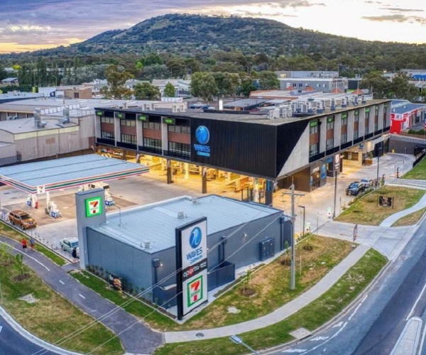
Epic Shine Car Wash, which opened its first location five years ago and recently added its sixth location, is an example of thinking strategically about colors and sticking with them. Although the business recently rebranded, the original colors selected for the company did not change and are prominent in the logo and website. Blue that represents loyalty as well as waves and water, along with a vibrant lime green that represents environmentally friendly and adds a pop of color, are the primary colors for the business, said Bryan Barker, Chief Operating Officer at Epic Shine.
— Dr. Sally Augustin, Design With Science
The lime green has become recognized as Epic Shine green in the community, but it has not happened overnight, said Corey Berg of Suds Creative. “Even though many building designs limit how you can use color on the exterior, the signature colors are used throughout the facility,” he said, such as in signage, marketing materials, lights in the wash tunnel, foam applied to cars and even the towels and employee shirts. The colors and branding are working so well, that it is not uncommon for employees to field the question, “Do you work at Epic Shine?” when wearing their shirts around town. “Employees like the lime-green polo shirts, and the colorful environment makes this a fun place to work, and to get your car washed.”
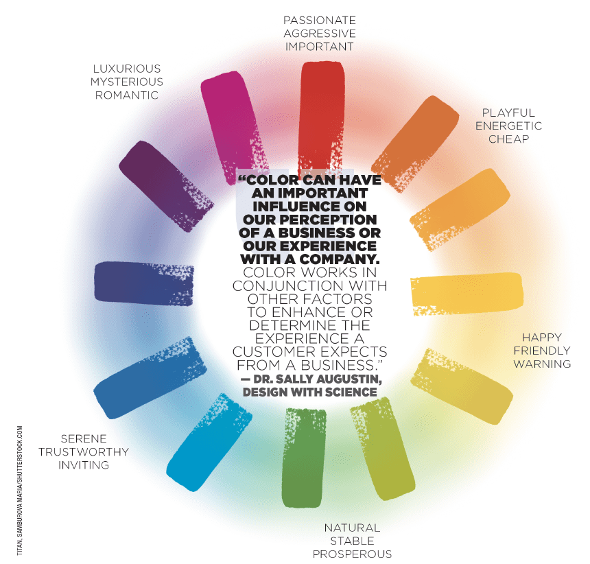
HOW DO COLORS INFLUENCE PEOPLE?
Red — Creates a sense of urgency, which is good for clearance sales. Encourages appetite, thus is frequently used by fast-food chains. Physically stimulates the body, raising blood pressure and heart rate, associated with movement, excitement and passion.
Blue — The preferred color of men. It’s associated with peace, water, tranquility and reliability. Blue provides a sense of security, curbs appetite and stimulates productivity. The most common color used by conservative brands looking to promote trust in their products.
Green — Associated with health, tranquility, power and nature. Used in stores to relax customers and for promoting environmental issues. Green stimulates harmony in your brain and encourages a balance leading to decisiveness.
Purple — Commonly associated with royalty, wisdom and respect. Stimulates problem-solving as well as creativity. Frequently used to promote beauty and anti-aging products.
Orange and Yellow — Cheerful colors that promote optimism. Yellow can make babies cry, while orange can trigger a sense of caution. Used to create a sense of anxiety that can draw in impulsive buyers and window shoppers.
Black — Associated with authority, power, stability and strength. Often a symbol of intelligence but can become overwhelming if used too frequently.
Gray — Symbolizes feelings of practicality, old age and solidarity. But too much gray can lead to feelings of nothingness and depression.
White — Associated with feelings of purity, cleanliness and safety. Can be used to project an absence of color or neutrality. White space helps spark creativity since it can be perceived as an unaltered, clean state.
Source: Small Business Trends


