The Car Wash Store design
April 1, 2012
8 minute ReadCar washes are retail businesses. They are also production facilities. This combination, with customer exposure to nearly all sides of the business, is relatively unique. (Put another way, how many McDonald’s let you walk alongside the burger-making process?) With these special aspects of the car wash business, there comes opportunities.
CAR WASH Magazine recently teamed up with retail designer Deeg Snyder of Gensler Architects in Chicago to learn about current trends in retail store design. Gensler’s clients include major OEM’s such as Toyota, Nissan and General Motors, where they help in designing dealerships worldwide. We also recently participated in a tour of car washes in the Netherlands, where car wash design has been truly reinvented. Whether you have an older wash or are looking to build new, we’re outlining ideas you may want to consider.
In thinking of the car wash space, we are likening it to a home with four design zones. We are choosing this approach because every customer is familiar with a home, but few customers are truly familiar with car washes.
(These are ideas and not recommendations. Refer to local zoning laws and the appropriate experts prior to any implementation.)
Design Zone 1
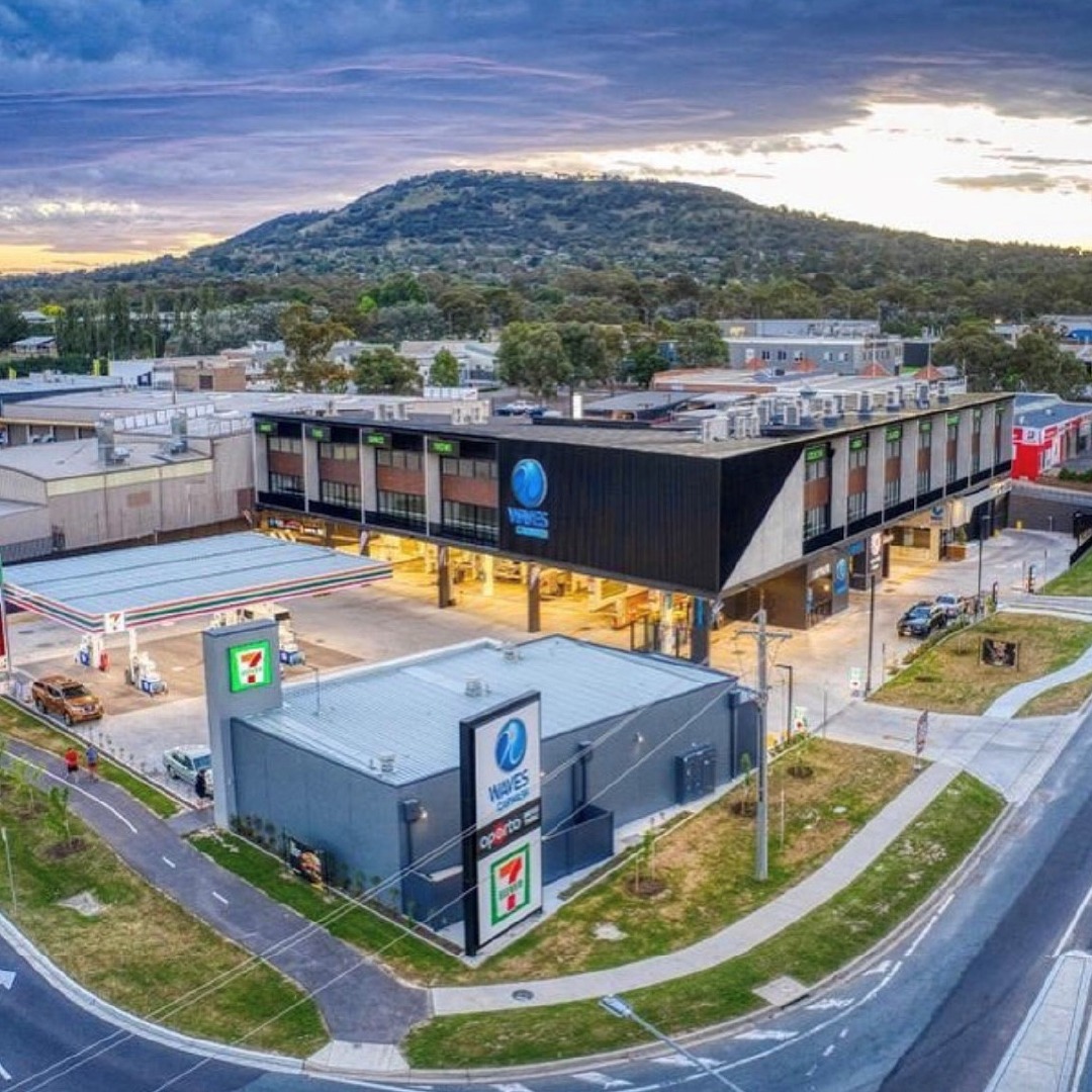
The Front PorchYou only have a few moments to make an impression on a customer, and on a busy street this can come down to mere seconds. The view of your business from the street is your front porch. It will communicate something quickly: cleanliness or disrepair, fun or frustration, speed or attention to detail. It’s imperative that you design your front porch to match your offering and brand. Some keys to improving this area:
Signage. Make sure passersby know that your business is a car wash with a sign that clearly makes that statement. Limit the number of fonts and colors you use in your signs so that the messaging is clear and concise, allowing the consumer to understand the offering.
Lighting. Lighting grabs attention and can provide a feeling of comfort and safety. For your lot, be sure lights are not placed too high — you may be wasting the potential of the fixture (through dissipation) if the lights are more than 12 feet in the air. Newer technologies such as LED fixtures offer long-term value and limit maintenance.
Façade. Use building’s frontage to your advantage with lighting, signs and eye-catching design. Even a simple change of color can catch a customer’s eye as they travel a familiar path.
Landscaping. Especially in models where customers wait for services — the exterior amenities and landscaped environment is an extension of the business.
Design Zone 2
The Entry Way
Your lanes and stacking/queuing areas are your entry way to the business. At this point, you are preparing customers for a business transaction (selection of a product and possibly the payment transaction) as well as readying their vehicle for production (loading or entering). The best retailers pay attention to every step and moment in this delicate dance.
Some ideas:
Lanes. Keep the pavement or concrete clean through the use of sealants and regular maintenance. Have lane marks frequently painted to maintain high visibility, and consider using cones if possible. Also, turns can cause anxiety for some customers. If possible, consider having the customer exit the vehicle (in the case of a full-service car wash) where the lanes are still straight.
Menus. Use simple and straight-forward menus to eliminate confusion and improve production times. Consider featuring no more than four wash packages and no more than two a la carte services.
Vehicle Egress Area. In the case of full-service car washes, allow plenty of room for customers to exit the car. Consider offering them a complimentary plastic bag to gather any items they’d like to remove from the car prior to the wash. This then becomes a trash bag they can keep, with your branding to inspire a return visit.
Design Zone 3
The Kitchen
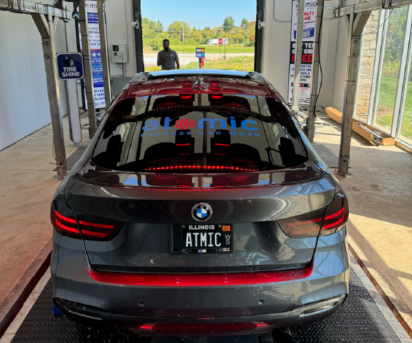
The kitchen is where the work gets done. In the case of a car wash, it’s the tunnel or bay. In home design, it used to be that kitchens were not considered living spaces. Today, that has obviously changed. The same thinking can be applied to the car wash.
Cleanliness. If your customer can see into your wash tunnel or bay, it should be as clean as a kitchen. Nothing is more defeating to a car wash brand than a dirty facility. As much as possible, look for opportunities to mask electrical, chemical and water lines; keep wash media clean and bright; and wash walls, floors and ceilings regularly. (Yes, this is simple… yet most washes do not do it!)
Light. At exterior car washes, where the customer remains in the vehicle, he or she is a part of the production. Use their time in the vehicle to merchandise the wash process. Light, including signage that describes the different components of the wash, can be a differentiator. Consider directing the lights onto the wall (as opposed to straight down) to amplify the impact of the light. Locate fixtures so that you cannot see them and they are not in the way of the customers — the best light sources are those you cannot see.
Design Zone 4
The Living Room
For those with interior lobbies, that space can be the living room — the place where you can visit, relax or even shop while the car is being washed. Particularly for a full-service wash, your customers will have several minutes in this area, and you want to maximize the opportunity to upsell or build loyalty. The living room for some washes may also be outside, in an area where customers can watch the vehicle being finished. In these areas, think about the following.
Merchandising. If you are offering convenience or impulse items in a waiting area, you are not just selling — you are merchandising. Shining light onto your products (particularly your higher-margin items) will catch the attention of your shoppers. Since storage for retail inventory is likely limited, use cabinets (perhaps integrated with your fixture or slotted display wall) that will keep inventory stored and displays clean looking. Offerings which cater to the “needs” are as important as the “wants.” Examples of items people may feel they “need” are those that enhance safety or security such as road flares, tire repair kits and all-weather blankets.
Comfort. In an exterior waiting area, consider softening what is likely a predominantly pavement/concrete area with interlocking pavers and landscaping. Also, many retailers are moving away from bench seating in waiting areas to individual seats, which provide a more individual and less communal feel.
Branding. Time in a waiting area is also time to market your car wash. This is the place where you can use signage to explain more complex menu items that are too difficult to read and digest in the stacking lane. Monthly unlimited programs or express detailing options should be prominently displayed here. This is also an opportunity to reinforce your wash’s brand. If your employees are an important differentiator, use your waiting area to display employee recognition awards or stories. You may even want to display your employment application and job literature, which can show your customers how much attention is paid to the people who are handling their vehicles.North American Versus European Retail Design Theory
As you’ve seen through many of the photographs in this article, the North American and European approaches to retail design are significantly different. North American design tends to rely heavily upon signage and words to communicate with customers. Conversely, Europeans tend to use merchandising and design to send messages without text. U.S. retailers are being increasingly drawn to this style, which feature clean and streamlined spaces. While a European approach isn’t the correct solution for every North American location, incorporating theories from other markets can be another way to differentiate your business from the competition.
Product Rotation and Brand Emphasis
Another trend that car washes can learn from the world of retail design is in the area of product rotation and brand emphasis. In a time of cost-cutting, many retailers will put the responsibility for marketing and product rotation back to the vendor — thereby reducing their own in-house costs. But, the downside of this approach is that you are left with a less than holistic environment for your customer. You can see this frequently in the car wash industry: you pull onto a lot that has a dozen different signs with the same number of fonts and colors from a handful of different vendors. The car wash ends up being very fragmented from the customer perspective, filled with myriad points of view. Instead, car washes should consider total design ownership, from the exterior of the building to the tunnel or bay.
Use of Digital Technology
Another hot topic in retail design is the use of in-store digital and media, such as in-store televisions or high-definition monitors. The prices of these monitors, and the increasing ease of use of software, have made them attractive and attention-grabbing additions to retail spaces. They also allow for quick and easy modifications to promote specials or updates. Some car washes have even begun installing monitors in the wash tunnel to describe or highlight value-added services or market wash specials during a time when the customer is “captive” to messaging.
Retail Personnel
Another commonly overlooked component of the retail strategy is the use of your personnel. This can be particularly easy to do in the car wash environment, when a significant amount of the training of employees focuses on complex operational and production roles. When designing or reinventing a car wash space, consider the physical space where your employees will be interacting with customers. If a human greeter/ticket writer is used, does approaching that person in a vehicle feel safe? When in a retail lobby, is the person at the same level as the customer and not behind an intimidating counter? Of course, training employees to be “retail-centric” in their thinking and treatment of customers is an essential component of a successful retailing experience.
While advertising, social media, pricing and other components of an integrated marketing plan are important, thinking about your business and property from a retailing perspective is an effective way to develop a holistic customer experience, and one that will maximize your business results.
Brand Experience
As many of the service providers in the car wash offering pool are local businesses with focused geographic impact, it is important for the local customer base to identify with you as a branded experience. This could be accomplished through the way your business looks, unique offerings based on your services or amenities. Walking through the experience as a customer is important, as well as making sure your brand is clear through the various steps and zones of impact.

